
Powerful effects colour has on website usability and conversion rate
27 January 2016

When it comes to website colour schemes, your selections can have both a direct and indirect effect on your site’s authority, so I decided to take a critical closer look at the research surrounding the role of colour in calls-to-action and how to make effective use of it.
While at university, I wrote a study on minimalism about ‘Stations of the Spectrum’ by Jo Baer. The piece is a triptych comprised of three white canvases, each surrounded by a band of a primary colour.
The main idea behind this piece is the way in which the white space is supported by the colours that surround it. In ‘Stations of the Spectrum’, the coloured bands enhance the space and, as most web designers with a few projects under their belt know, colour can also be used to enhance a page on a website.
More importantly, colour can be used to highlight areas of attention. It’s often all too easy to get caught up in the modern world of monochromatic colour palettes and hero images, while forgetting that select usage of a bright colour can help to create a functional, user-centric website that serves both client and user needs.
Recently, I’ve been reading up on some studies into conversion rates and how they are affected by the use colour. There are all kinds of theories into which colours should be used for call-to-action buttons, with the two most common suggestions being blue and red, although almost every colour has at some point been through A/B testing with mixed results.
While researching these results, I started to notice some patterns which I believe are a larger contributing factor. Further research into this led me to articles of usability experts and digital marketers who had made the same observations. So here is a list of these observations:
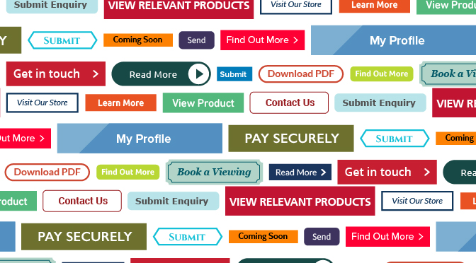
Generally, red seemed to generate the most conversions

This was not always the case, however, and seemed to be more of a subtle trend than an outright cause and effect. Any difference between the impact of different colours seems to be fairly arbitrary.
We may even see more of a trend here than there actually is because this fits our preconceptions within western culture; red is seen as a powerful colour and is often used for signs denoting danger and urgency. What’s more, it’s rare that we see a website with a large use of red, leading to situations where only red elements on the page are often calls-to-action, causing them to stand out.
On websites where red is one of the main colours used for background elements of the site, selecting a colour to contrast with the red for calls-to-action would generally lead to a more obvious and user friendly site.
In 2011, Bing increased their revenue by researching colours and changing their links to the blue
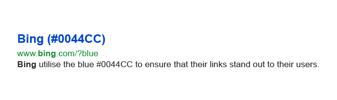
The prevailing reason that this blue seems to work well for search engine results is not that this particular hue catches the eye of the user, nor does it have a soothing tone that draws them in, but that, as Microsoft engineers themselves admitted, this blue is “quite similar to the one used by Google”. And really, this is no surprise.
We’re all creatures of habit and learning, and utilising information that has already been learnt by the majority of web users matches existing cognitive models in our head, which makes a task easier.
For example, most web users have learnt that clicking on the logo in the left of a navigation bar will take them to the homepage of that site; if you were to replace this with a link to the contact page, this would throw a lot of users off.
The truly significant changes in conversions only came from circumstances in which there had been no colour originally

The first thing I found to note from this is that it is highly effective to have a button in a colour that enables it to stand out from the rest of the page. This is something that benefits both marketers looking for an increased conversion rate, and users looking for a simple way to navigate the site.
It’s all well and good if your site ‘looks good’ with thin, sleek monotone links, but if a user can’t find those links, they are quickly going to abandon the page.
There does seem to be one slight rule to which colour you should use
Another subtle change that I picked up on was that in instances where a button that was a similar colour to the company logo was tested against one that was completely different, the different colour almost always got more conversions.
As a UX/UI designer, the thing that I find most interesting about this, is that it helps to improve the usability of the site. I’m not saying anyone should add a bright red contrasting button to their site if it’s going to clash terribly with a bright green logo, but the use of a suitably different, but complementary, colour can be an informed and easy way to start enhancing the experience for the user.
So in much the same way that, without colour, ‘Stations of the Spectrum’ would be comprised of simply three white canvases, without a sensible use of colour, most websites lack an initial understanding of usability.
It’s not only the designer’s responsibility to make sure that colour enhances user experience, but also that it fits with the colour palette and design of the website. If you can find the balance between these two, you’re somewhere on the right lines.

Blue Wren
Categories
Blue Wren