
Evolving a brand (part 1): the logo
02 November 2017

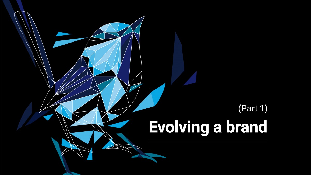
Regular visitors to the Blue Wren site may have noticed our new look website and branding. Well, our website and services aren’t the only things to have evolved over the years; our blue wren has grown up since we were founded.
Sam, the Creative Lead behind our recent brand refresh, looks at our wren’s evolution.
Starting in 2010…
Our hand-drawn wren, in the top left, was there for the birth of Blue Wren back in 2010.
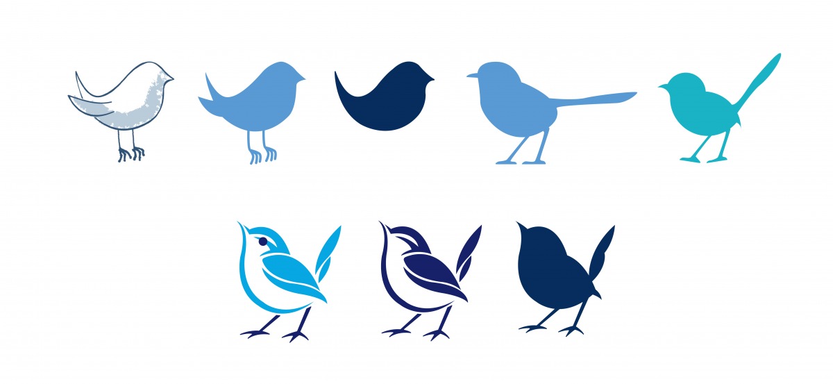
Above you can see the thought process of how I was going to adapt the original hand-drawn bird into a logo. It needed to reflect not only our company as it stands today, but what it would grow to be in the future. I designed many variations and above are just a small selection… Until finally our new blue wren was born.
He stands proud, looking forward.
![]()
…up to the present day
Reaching today’s confident wren has been a journey.
Over the years, as we’ve defined our values, the logo design has become increasingly important; there is a fixed list of characteristics that the logo must now represent.
So, as our business evolved, so did our logo. What previously represented a new business, now has a clearly defined purpose to create positive change for likeminded businesses.
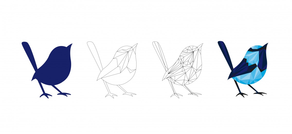
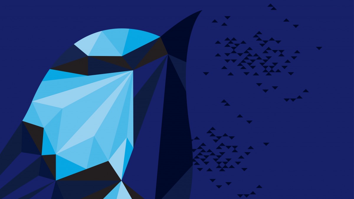
Birth of the polywren
Once the only visual representation of Blue Wren, our solid-silhouetted wren now has a new persona.
He serves as the foundation for our evolved message. He’s still an important part of the Blue Wren brand, but now he also forms a platform for our evolved message and polywren.
What they represent
They both represent different aspects of the service we provide.
Our solid blue wren, simple in form, represents our core purpose; creating positive change.
The simple wireframe bird shows the first sign of the process evolving. He reflects the early stages of a project where our team get to understand a company and what makes their team and customers tick. He represents where we start to shape the project.
The polygon wireframe wren reflects the team working together, becoming something bigger than the individual. This is the puzzle coming together, where the iterations of our process form the final product.
Finally, we have our polywren; he represents the final product. The simple shapes make up a complex pattern… We make the complex simple.
Although it is our work together that drives the most success. Something we also represent with our branding, which is discussed in part 2.
In the meantime, if you would like to discuss how we can help you create similar positive change, through either our software or web design, get in touch.

Give our team a ring on 01772 920777, contact us via our enquiry form or drop us an email at hello@bluewren.co.uk.
Blue Wren
Categories
Blue Wren
In this article you can:
- learn how a professional Creative Director evolves an established brand
- learn what a logo can truly represent
- follow the evolution of Blue Wren’s logo